I just thought I would give a brief overview of what I have been doing so far, in regards to my Graphic Design practical project for my degree.
First things first, the initial ideas I came up with, basically these are the things i felt I would find interesting to do a practical project on:
- Re-design a set of symbols, potentially from the British highway code, simplify them and ask whether they can be effectively, easier to read.
- Something based upon information graphics, such as maybe re-designing National Rails timetable layouts or even a navigational system for an airport.
- Think about how propaganda could be used in the 21st Century to effectively better the current global situations of climate change, war and starvation.
- Create a fake society, except this society is built around everything we fear in our current one. Could be approached from different angles so I get a mixture of Western and Eastern fears, potentially different movements, communism, fascism, capitalism.
- Create a series of informative pieces looking into a particular area, whether it be a road or a town.
I decided to choose the airport idea. The reason for this being: I often find myself confused in airports, most places of transport actually, I also see other groups of people who seemingly look lost at airports. I wondered why this was, perhaps the way-finding and navigational systems are not up to scratch? I have now decided to investigate this and find ways in which I can improve, maybe revolutionise signage, to make it clearer, simple to read and interpret.
The next stage was to look into some ways which I believe could make travel easier. Initially I done this in the form of a spider diagram, see below:
In-between most of my sketch pad pages I have already begun thinking of different design concepts that could be integrated into an airport to make life easier and less stressful for those travelling. This particular sketch (see below) shows the concept of; each set of gates have their own colour code, this colour gets translated to the floor, maybe in little circles, potentially arrows. These are to be followed thus making it easier to find your gate.
An issue I came across with this concept however, is if you are watching the floor for your colour coded symbols, this could cause a potential health and safety risk, with people walking into each other. Also it means the rest of the signage could potentially become ineffective as you would spend less time looking up and around and more time concentrated to the floor:
I also looked into a few factors such as:- Typography, Symbols, Colour, Lighting, Layout and anthropometrics. This was to try and produce a good base to research from, as I don’t want to get stuck half way through. see below for a sample page of broken down titles and sub-titles:
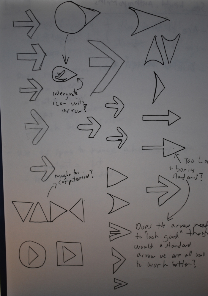
Another in-between page looking at different arrow concepts, some are much too computer looking, and potentially ugly looking. In looking at the arrows though, a thought came to mind, do the designs HAVE to look good? Could they not suit their purpose over how they look. In this sense I think I am quite biased, as I do like the concept of Function over Form. However, in a stressful, busy, quick environment such as an airport, is there really a need for things looking good? If they are clear in their form, therefore function to maximum capability would that not be enough? I shall show you an example of what I mean below:

We can all see that these are arrows, but which one clicks first? I personally think the left arrow is the least clear, the middle is easier to establish and also looks quite aesthetic. But the right arrow is what we know from a very young age as being an arrow, we can associate that shape as a direction instantly without a seconds hesitation. So in this sense why should it not be used? Also, maybe I should design a full set of icons in this project which is based plainly and simply around what we automatically know, and less about what looks good. Below is my page of arrows, take note of the small arrow with an aeroplane, this was a concept of including the symbol inside the arrow:
Ok, that’s all well and good, but what do I actually want to achieve in this project. What are my final set of goals? This is what i have thought about so far:
- Find the best way to get information across to people so they can navigate stress free, with confidence and ease
- Discover what set of colours would work best in an international airport situation for way finding.
- Produce my own typeface which is potentially the perfect way finding typeface, easy to read, works at a distance, no confusion.
- Design a set of internationally recognisable symbols for an airport which aid in way finding. These symbols could work alongside text, or perhaps as a stand alone object.
- Find a good, clean, simple, easy to read layout, using a hierarchy system of information.
- Piece all of this into a designed document bringing all my research ideas and final concepts together.
Next up are just a few pages where i have discussed current signage, drawn out a few of my own concepts and also a couple of computer ones:
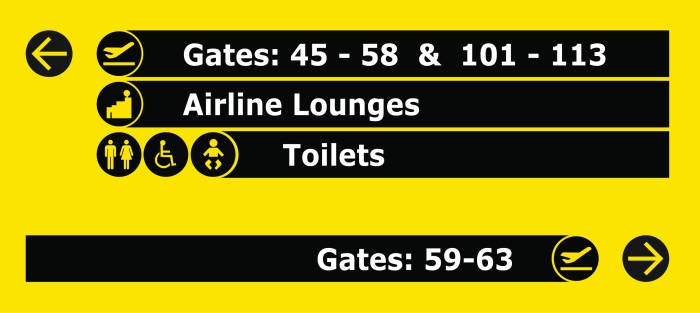
This next image is a quick design I put together, it is based around the sign in the above image. I have used Gatwick airports icons and colour combinations for now, I just felt this could be a better layout. Some aspects i feel work, others not so much:

So that’s it, a brief overview of the things I am getting up to thus far.
I now have to focus more on my essay and getting some good solid research for that, that I can write about, I feel I have got off to a good start with this project, if it continues throughout the year like this, with a little more push, I know i can achieve the best grade possible.
Tom out!


I think the navigation on the floor is an awesome idea. Signs usually tell you the general direction but the floor idea would tell you ‘exactly’ where to go.
As for the health and safety I agree but only because they have gone hugely overboard with it. In a sensible world it would be fine, you do not have to lookdirectly down at the floor to see a bright blue line for example. It would also need some arrows along the way as you do not want people to go the oposite way! And I think this could only work in airports. It would be cool though if we could associate say the colour orange with toilets and green for restaurant etc. Kind of like with crisps you know the flavour instantly by the colour.
LikeLike
Thanks for the comment!
I see what you are saying in regards to the health and safety.. unfortunately we don’t live in a sensible world, but maybe I should take it further and explore other possible ways of doing a similar thing.
The colours is an interesting concept, however like when walkers changed salt and vinegar to green instead of blue, it through me completely off haha.. so colour change may then create issues (people always like to change round colours)
Some good things to look into with this. Thanks again!
LikeLike
whoa Tom – huge post!
Really detailed written analysis alongside visuals – love the sketchbook pages where you are drawing and testing – and I much prefer your little re-do of that black and yellow gatwick sign 🙂
You are definitely getting stuck into this – your making me start to panic Tom! Looking forward to seeing more soon!
LikeLike
Thanks Dawn!
I have found that i’m getting quite passionate about re-doing the airport signage and also quite angry at the crappy state of Heathrow and Gatwick’s current attempts, as it truly is something i could knock up myself given a couple of hours 100% from scratch at work, and we only deal with smaller companies. I really want to produce my own and get it made by a large company who deals with this sort of signage, regardless of the costs, i think it would be a very nice piece to create.
I’m not doing too badly with the GDP4 project, but i need to solidify my essay research a little better and get more of that written, at the moment it is only small sections and a lot of bullet points. Aiming to get it all done by the end of the summer, ready for a draft hand-in.
Cheers for stopping by 🙂
LikeLike
yes, well signage is definitely one of your fortes Tom 🙂
Agree with you on the essay researching – working towards getting a huge platform from which to condense and ‘solidify’ as you say – the more work we achieve in the summer, the more time we have free to achieve more when we go back = good sense 🙂
LikeLike
Nice post thomas – I like how even with little changes the signs already look more readable especially with the arrow, which i agree is more clear :). Be really interesting to see what you come up with.
I like how everyone is doing very differerent things should make for some interesting final pieces
LikeLike
Thanks mate, yes definitely will be an interesting year with so many different projects going on! Still wondering what it is you are getting up to, not heard too much from it, but i’m guessing I will as time goes on 😀
Thanks for stopping by!
LikeLike
nothing but research not as in depth as you
LikeLike