I’ve recently continued my journey of watercolour painting after being inspired by the art of French Impressionist Adolphe Valette. The odd thing is that Valette was traditionally an oil painter. He dabbled in watercolours but my inspiration came from his oil paintings of industrial Manchester.
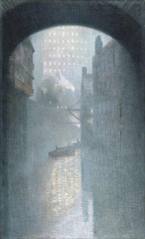
I think his use of colour and depth to portray the smog in the landscape is phenomenal, and I set out to try and reflect that in my paintings.
However, as you will see, that didn’t go quite according to plan and I ended up with a far brighter, cheerful and more detailed painting.
Barges on the Thames, London
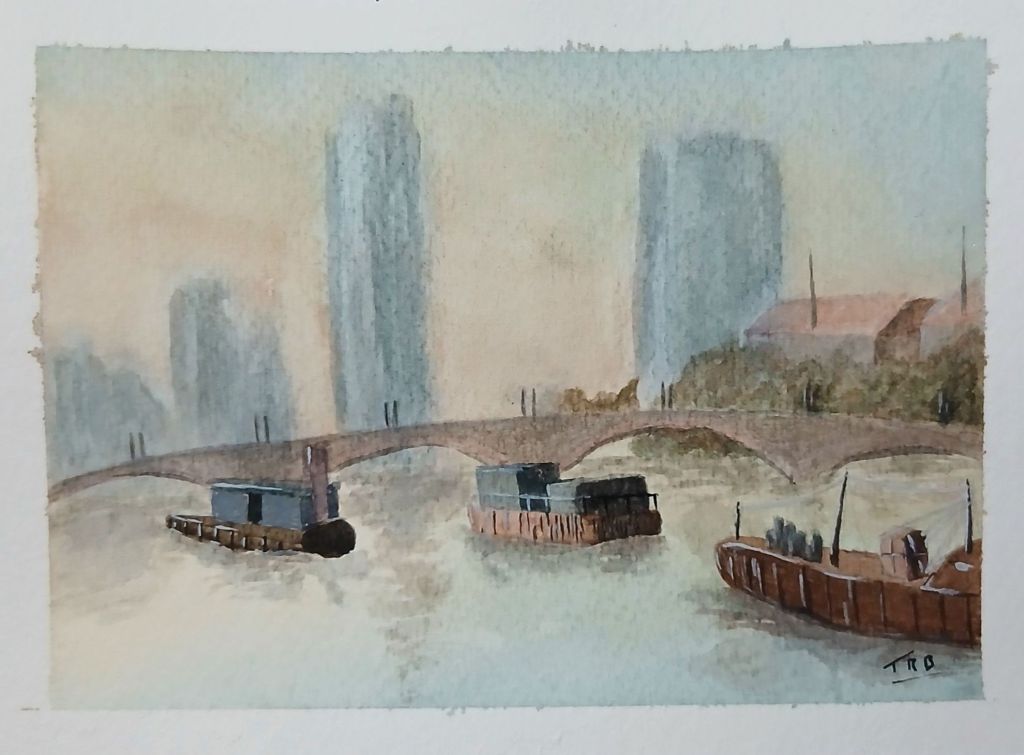
This wasn’t all bad. London today isn’t the bastion of smog that it once was, and it is a far cleaner and more vibrant city. What did work for me was the depth I added by fading the buildings into a misty background.
This painting was also the start of a journey that has given me far more confidence in my painting ability. As well as inspiration to be much more experimental in art, and not just with watercolours.
Stratford Walk Bridge, Queen Elizabeth Olympic Park
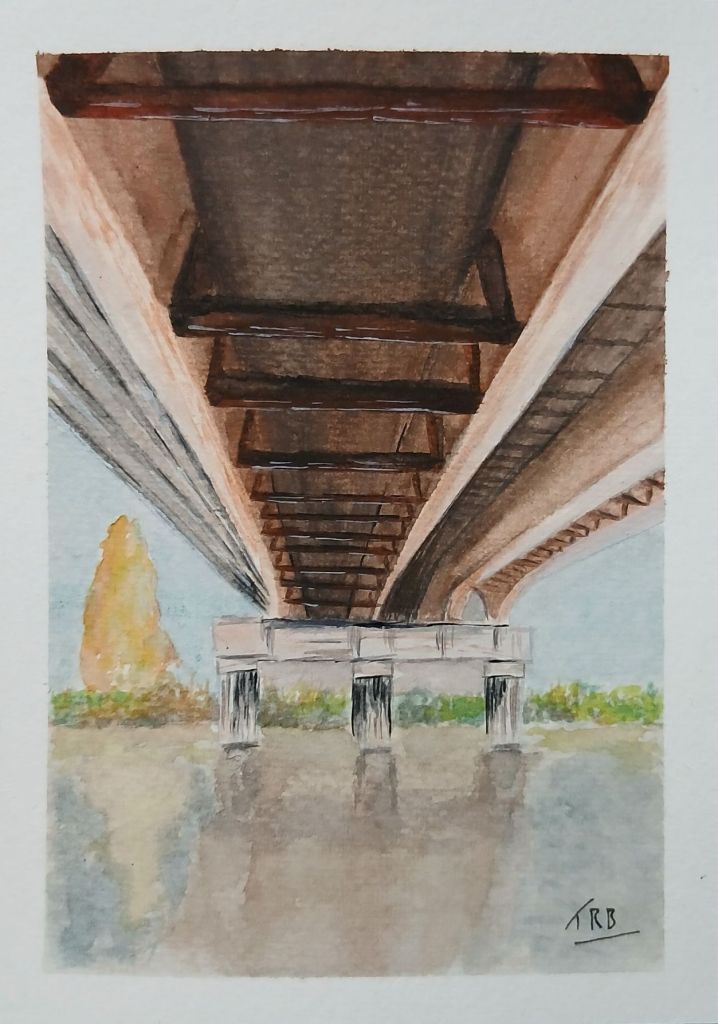
My next painting titled ‘Stratford Walk Bridge, Queen Elizabeth Olympic Park‘ was slightly different as it focused on an unusual view of a bridge over a canal. Getting the correct perspective and 3D effect was a challenge, but drawing out guidelines with a ruler and pencil helped. It wasn’t until the girders were painted that it started to look 3D.
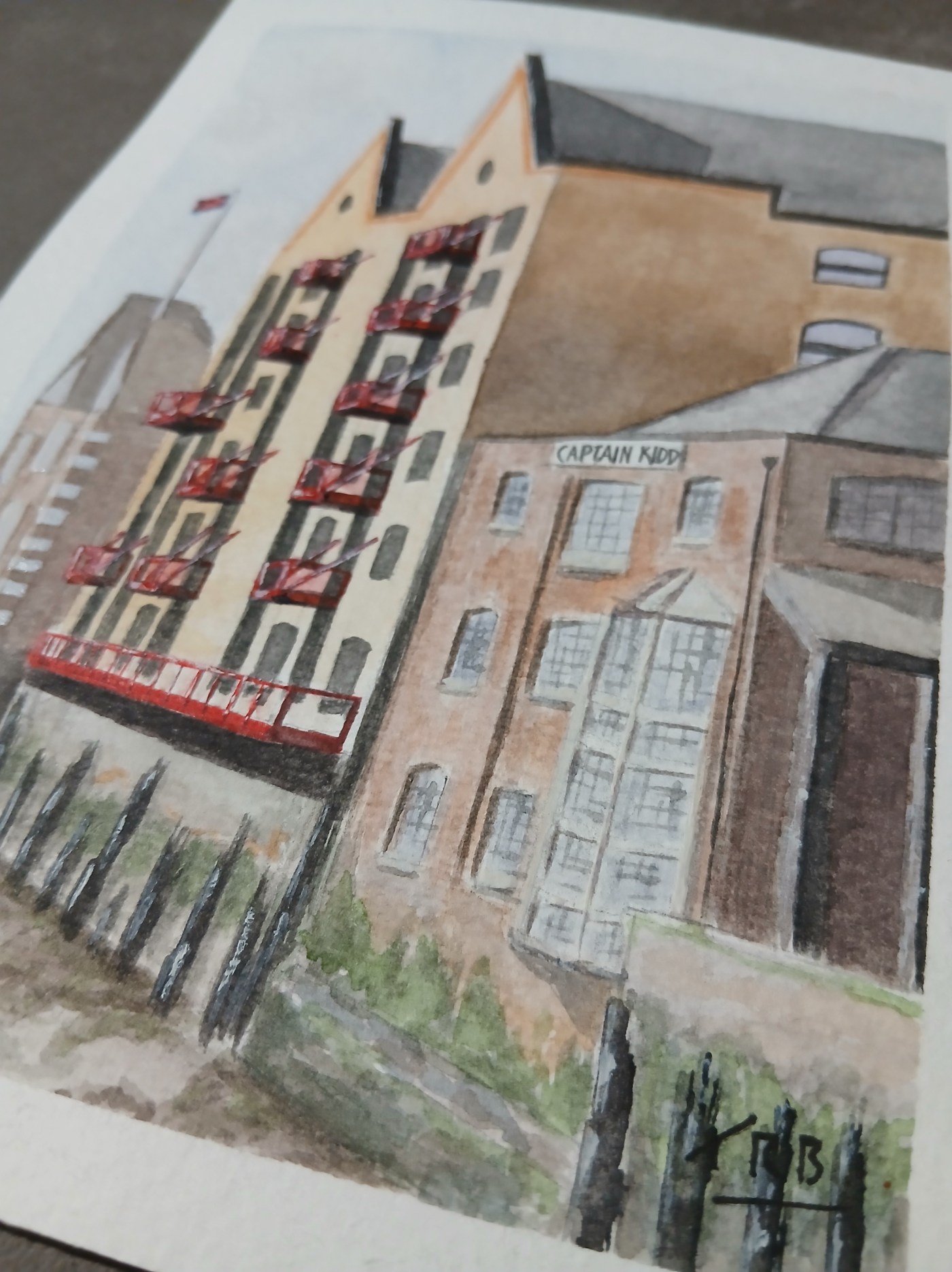
The Captain Kidd, Wapping
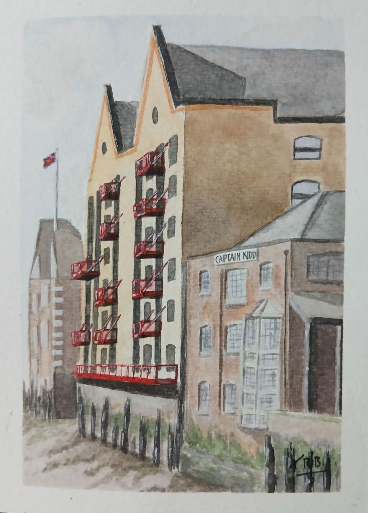
I wanted to paint a scene with a little more complexity and visual interest. I looked through my photos and came across one I had taken many years ago of The Captain Kidd pub in Wapping.
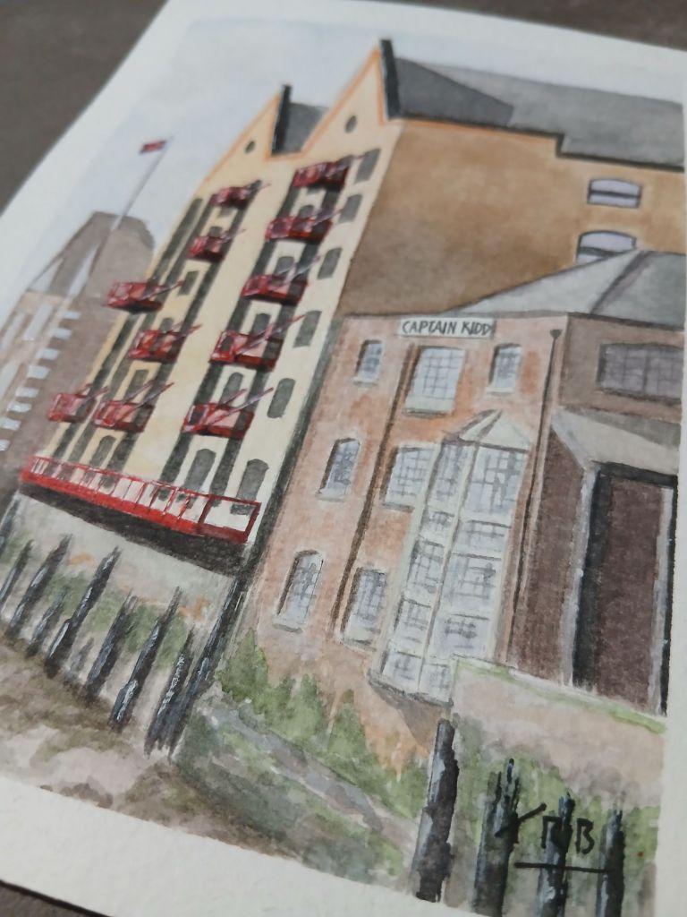
This painting has introduced me to more subtle use of colour and gradients. Plus, layering drier paint on top to create shadow and texture. I liked the challenge of the perspective and once again used my trusty pencil and ruler to draw in my perspective lines.
One criticism I have with this painting is I think I made the red a bit too stark against the rest of the painting. It was an afterthought to add in the balconies and perhaps should have been done a little earlier.
I am very happy with my newfound exploration and confidence with watercolours and look forward to continuing my journey.

Leave a comment