I know there has been 3 posts in relatively quick succession but, as you can see, i have been busy with new ideas and would like to share them on here with you guys for opinions…
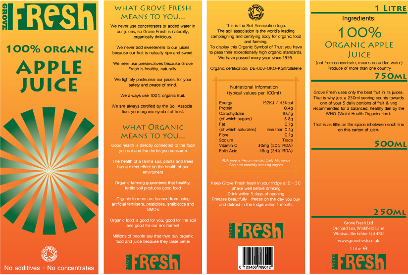
This is the Apple version of my recent idea 1 design.
I think i prefer the background gradient of this one, although think the overall packaging would be better as an orange juice rather than apple. I think this means back to the drawing board for idea 2. Idea 2 is going to be a lot simpler, with neutral colours and a whole new logo.

Tom out!

Leave a comment